written by http://tekeye.biz/2013/android-menu-vs-action-bar
Android Menu Vs Action Bar with Example Code
An Android Menu in Your App
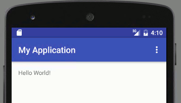
When a new Android App project is created in the Eclipse or Android Studio IDEs there is the option to create a default activity (the Create Activity option in the New Android Application wizard). If the option is checked and Blank Activity is chosen a simple App ready to run is generated. This App simply shows the message Hello world! on the device screen (see Your First Android Hello World Java Program). This simple App has a menu with one item called Settings. On devices with a physical (hardware) menu key, the Settings menu option appears at the bottom of the screen, when the key is pressed:

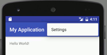
On devices without a hardware menu key, Android Version 3.0 and later devices (API level 11+), an icon in the Action Bar shows the Settings menu item. This icon is referred to as the action overflow. However, due to it’s stacked appearance in this article it will be referred to as the menu icon:

The above two screens show the older Android menu vs Action Bar menu, i.e. pre-Honeycomb using the physical menu key, and post-Honeycomb menu using the Action Bar icon (3 small stacked boxes icon know as action overflow). Further differences in use are examined in this article with code examples. Here is the code for this basic App:
Defining and Showing an Android Menu
In the above code it is onCreateOptionsMenu(), which is called when the menu key or menu icon is pressed. The Settings menu is shown using getMenuInflater().inflate(). It is passed the id of the menu definition, R.menu.main. This id comes from the name of the menu definition file main.xml, stored in the res/menu folder in the project tree. If the file was called mymenu.xml then the id to reference it would be R.menu.mymenu. Here is the file generated for the default project:
Selecting the Settings menu item does nothing. There is no code that is activated by that menu item in the generated project. For such a simple menu the only item of relevance in the menu.xml file is the android:title attribute. It gets the Settings string from the strings.xml file in the res/values folder:
Calling Code from an Android Menu
To respond to the Settings menu being pressed the Activity must override onOptionsItemSelected(). Here is an example to simply display a message. This code is added to the bottom of the Activity’s class before the closing brace (the MenuItem and Toast imports will be required).

Alternative Code Calling from Menu Selection for Android 3.0 and Later
If the App is designed for Android Honeycomb or latter (API 11+) an alternative to overriding onOptionsItemSelected() is to define a public method in the class (the method must take a MenuItem and return a boolean), then assign the name of that method to the android:onClick attribute in the menu definition. E.g.:
And here’s this method referenced in menu.xml.
(If an App contains both methods for calling code from a menu, onOptionsItemSelected() and android:onClick the former is used on pre-Honeycomb devices and the later on post-Honeycomb devices.)
Android Menu Item Shown in the Action Bar
One difference between the Android menu vs Action Bar is that the Action Bar can show a menu item directly. In the menu.xml file change the android:showAsAction attribute to ifRoom:
Android 3.0+ devices now show the menu item on the Action Bar instead of the menu icon:

Several Menu Items in an Android Menu
Add multiple item definitions to the menu’s XML file to add other menu options:

Obviously the different menu captions come from different string definitions:
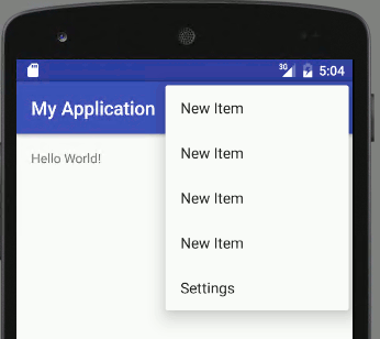
If the android:showAsAction=”ifRoom” attribute setting is present but the all the items do not fit on the Action Bar then the menu icon allows access to the unseen items, hence why the icon is called the action overflow:

In this instance one advantage of the Action Bar is that it can reduce by one the number of times the user presses the screen. Instead of pressing the menu icon and then selecting the menu item, the user presses the item directly.
Determining the Android Menu Item Pressed
In the method called by the menu item test the MenuItem id to see which one was pressed:
Android Menu vs Action Bar Icons
Android menus support the showing of an icon. Prior to Honeycomb the menu icons were the same size as the App launcher icons. They differed from launcher icons by being a flat image in a single color, usually grey.  A medium density launcher icon (the blue gear icon shown here is an example) is 48×48 pixels in size. It used to be recommended that the contained image should fit into a centralized 40×40 pixel box. Thus leaving a border one twelfth of the launcher icon size. One twelfth of 48 is 4. A 4 pixel border taken from each side of the 48 width and height leaves 40×40 for the graphic image.
 The menu icon required a border twice as wide as a launcher icon. For the old style menu icons the wider border reduces the contained graphic to 32×32 pixels. Thus for a pre-Honeycomb menu icon the border is one sixth of the icon size. One sixth of 48 is 8. An 8 pixel border taken from each side of the 48 width and height leaves 32×32 for the graphic image.
 With the release of Android 3.0 the border requirement for launcher icons is not as important. The menu icons for the Action Bar are now smaller, specified as 32×32 dp (density pixels). On a medium density screen that is 32×32 pixels. The image in the icon is 24×24 dp (24×24 pixels on a medium density screen). So the border is 4 pixels wide (32 minus four from each side is 24). For a light theme icons are colored #333333 with 60% opacity when enabled (30% disabled), and for a dark theme white (#FFFFFF) with 80% opacity when enabled (30% disabled). See the Iconography page on the Android Developers web site.
The parts of the icon that are not the image are transparent, as is the border. This allows the icon to sit cleanly on the background. If parts of the image in the icon need to protrude into the border area then that is allowed. The border size is a guideline and in some cases the icon image needs to use some of the border space to achieve a pleasing look. For more examples of icons look in the sub-directories of thedata directories, under the various platforms in the Android SDK install location. The icon file names normally start with ic (ic_menu… for menu icons and ic_launcher… for launcher icons), this is a naming convention and not an absolute rule. There are some example launcher icons on the Android Graphic Resources page. At the Android Developers web site there is an Action Bar Icon Pack, it contains light and dark icons.
Before showing how to implement icons in an Android menu a couple of considerations need to be explained.
Why Light and Dark Android Menu Icons?
When developing an App it is possible to change the UI look by applying styles to the various screen elements. These styles collectively are known as a Theme. Since Android 4.0 (API level 14) three themes are provided by the OS that are stable and always present, Holo Dark, Holo Light and Holo Light with Dark Action Bar. These themes were present in Android 3.0+ (API level 11), however, they could be changed by the device manufacturer, as some did in earlier devices. The Holo themes were not present prior to Android 3.0. Thus the system theme prior Android 3.0 is different to the Holo themes. The Android Gingerbread release (API level 9) system theme also differed from previously releases. Finally there are rooted devices that can have different themes. This provides a problem to some standard user interface elements that are not styled with a custom theme. The settings (options) menu item is one of the problematic elements. Depending upon the device the App is running on the menu item will have a dark background with white text, or a white background with dark text. Hence the need for dark and light icons. This is not a problem if an App is being styled. However, styling an App can be a large chunk of work. This is why some developers are happy to use the devices standard theme. How does this affect icons? Without styling it is not known if an icon is guaranteed to sit on a light or dark background, unless running on Android 4.0 or later with one of the default Holo themes. There are some hacks around that can be employed, however, one of the easiest solutions is to deploy an icon that is dark grey with a very light or white border. That way one icon can be used for both dark and light backgrounds, and will work on all devices and Android versions:
Android Menu Icon Size Issue
Which of the two icon sizes should an App use? The older 48×48 dp? The newer 32×32 dp? Both? With pre-Honeycomb devices falling in numbers eventually only the 32×32 dp icons will be required. In the meantime both sizes should be provided. It is possible to use just the newer size. The 32×32 dp icon works on pre-Holo devices (see previous image). It appears smaller but is still adequate. This allows the option to only produce one set of icons for the settings menu in an App.
Setting an Android Menu Icon
To set a menu icon for an Android settings menu first add the icon file to the res/drawable folder. Then in the menus XML file assign it to the android:icon attribute:
(See State List if an enabled and disabled icon is used.)
To display only the icon or only the text remove the appropriate attribute. For Android 3.0 and later that has the action bar the icon is shown by default. The text can be displayed by adding withText to the showAsAction attribute. Then if the action bar has room for both the menu icon and the menu text both are shown:
Android Menu Icon Physical Size
Sizes of screen elements should be, and are normally, specified in density pixels. A density pixel is apporoximately the same size on all device screen densities. There are five screen densities, low (LDPI), medium (MDPI), high (HDPI), extra high (XHDPI) and extra extra hiigh (XXHDPI). The low screen density is no longer popular and is no longer supported by many Apps. Medium density is the base size where one physical pixel is approximately the same size as one density pixel. The other density sizes are multiples of the medium density. What this means is that to supply a menu icon that looks good on a range of devices provide a bitmap for each density:
- LDPI = MDPI * 0.75 = 32 * 0.75 = 24×24 pixel icon (includes 3 pixel border), store in res/drawable-ldpi
- MDPI base 32×32 pixel icon (includes 4 pixel border), store in res/drawable-mdpi and res/drawable (for Cupcake)
- HDPI = MDPI * 1.5 = 32 * 1.5 = 48×48 pixel icon (includes 6 pixel border), store in res/drawable-hdpi
- XHDPI = MDPI * 2 = 32 * 2 = 64×64 pixel icon (includes 8 pixel border), store in res/drawable-xhdpi
- XXHDPI = MDPI * 3 = 32 * 3 = 96×96 pixel icon (includes 12 pixel border), store in res/drawable-xxhdpi
written by http://www.i-programmer.info/programming/android/8521-android-adventures-menus-a-the-action-bar.html?start=1
| Android Adventures - Menus & The ToolBar Menus are slightly different from other UI components in that they have to be created without the help of the Designer. No doubt at some point in the future a menu designer will be added to Android Studio but at the moment we have no option but to work with the XML. The basic principles are the same in that a menu is a collection of View objects. You can create the View objects in code or you can use an XML file and a special inflater - a MenuInflater - to convert it into the objects. Defining a menu is more or less the same process every time but the way in which you use the menu varies according to where and when the menu is shown but even this follows roughly the same steps. Let's look a the general idea first. The Menu TreeA menu is a hierarchy of options. The top level menu presents a set of items. If any of the items is itself a menu, i.e. a sub-menu then it can contain more items. Android menus make use of three objects and hence three XML tags:
There are also a range of attributes that can be used with <item> and <group> and not all can be used in every situation. The three that you need to know about are:
With all this explained let's define a menu with a single File item and a submenu consisting of two items New and Open.
If you use Android Studio to create a new Menu Resource file then you will discover that it helps you enter the XML by suggesting autocompletions. All menu resources are stored in the app\res\menu directory. If you right click on this directory you can select the New, Menu resource option and type in a name - all lowercase as usual. You can see in the menu example that we have a top level menu item that we don't bother giving an id to which contains a single <item> tag this displays the text File when the menu is displayed. In case you have forgotten the notation "@+id/name" automatically creates the id resource name and sets it to a newly generated integer value. You can then usename in code to find and work with the menu item. The <item> tag contains another <menu> tag which in turn contains two more items that correspond to New and Open file menu options. Exactly how this simple menu looks depends on how it is displayed but it defines a menu with a single top level File option which when selected displays a submenu of two other options New and Open. Displaying A MenuThere are four different ways you can display a menu:
The action bar was introduced in Android 3 and it is a replacement for the original options menu. You should always use the action bar or its replacement the Toolbar as the primary menu for your application. With Android 5 a new way of implementing an ActionBar like menu menu was introduced The Toolbar is a standard widget that can be edited using the designer. This makes it easier to integrate and work with. If you want to use the ActionBar in earlier versions of Android you need to make use of the Support Library - this is automatically included when Android Studio creates a project for you. The context menu is a popup menu that appears in response to a long click on a component of the UI. The contextual action mode is bar that appears at the top of the screen when the user long-clicks on a UI element and it is supposed to be used to provide actions that are appropriate for the item that has been selected. It too needs the Support Library to work with older versions of Android. The popup menu can be displayed in response to almost any user action you care to use. It appears next to the View object that causes it to be displayed. For example you could have a button that displays a popup when clicked or a popup could appear when a user types something into a text field. It is difficult to know exactly when to use a popup menu. Logically the next step would be to use the XML file we just created to display either a contextual action mode or a popup but as the default project type generates the code and menu resource file needed to implement an action bar/tool bar, and it is used in most applications, it is better to start with it. The remaining menu types are the topic of the next chapter. |
| Written by Mike James | |||||
| Tuesday, 05 May 2015 | |||||
Page 2 of 4
The ToolbarIf you start a new basic Activity project called MenuSample then you will discover that it automatically creates a main_menu resource file and the code needed to display it as a tool bar. Previously it would have added an App Bar but Google recommends that we change to using the Toolbar widget. The basic Activity template uses the support library to make it possible in earlier versions of Android. In this case the Activity has to derive from the AppCompatActivity class:
and we need the imports:
The Toolbar is defined in activity_main.xml as a custom widget:
... Notice that the Toolbar's style is set to AppTheme. This is important as the style selected changes the way the Toolbar is displayed and can stop it from displaying altogether. Also notice the tag <include layout="@layout/content_main" /> This loads the layout that you design in content_main.xml. When the Activity loads onCreate runs and inflates the layout in activity_main.xml and the included content_main.xml. This is enough for the toolbar to display but for it to be used as a toolbar by the system we need to add:
All of this code is generated for you automatically:
Now if you run the app you will see the familiar Hello world message and the default toolbar:
In fact it is so familiar you may not even have realized that it is a menu. The toolbar has the name of the app to the left and a three dot icon to the right. If you select the three dot icon the Settings menu item appears:
If you take a look at the menu_main.xml file you can see the definition of this menu:
You can see that this defines a single menu with a single item with the title Settings as determined by the resource string @string/action_settings. There are some new attributes being used in the item tag. The showAsAction attribute is important for the way the action bar works. By default the system places menu items into the overflow area that is only revealed when the user selects the three dot icon or more generally the action overflow icon. However for items that you would like to give the user a more direct access to you can set the showAsAction attribute. This can be set to any of the following:
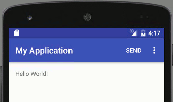
As you can see the Settings item in the default action bar is set to never show. The showAsAction attribute works with the orderInCategory attribute to determine the order that items are shown. To see this in action let's add another item. Add to the end of the menu_main.xml file before the final </menu> tag:
Now if you run the app you will see:
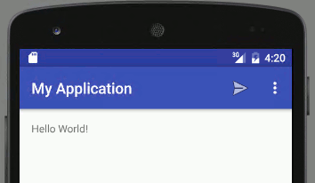
This works and the new item will be displayed as long as there is room - if there isn't it will appear when the user selects the three dots icon. It is usual to show toolbar items as icons so change the item tag to read:
where we are using one of the many supplied icons.
You can carry on adding menu items to the action bar and generally customizing how they display given different screen widths - the general idea is the same for all menus. Creating The ToolbarSo far we have just looked at the menu_main.xml file and the XML specification of the action bar menu. There is also some code generated to actually create the menu displayed in the Toolbar. The Activity will fire a CreateOptionsMenu event when it is ready to display the toolbar recall the toolbar used to be called the actionbar and before that the Options Menu. All the onCreateOptionsMenu event handler has to do is inflate the XML file that defines the menu:
The onCreateOptionsMenu is called once when the Activity starts. Before Android 3 it was called each time the menu was displayed on the screen but later the actionbar/toolbar is always on display. How to change the toolbar is discussed later. All the event handler has to do is use the appropriate inflater object to create the menu from the resource file. The new View hierarchy of menu and item objects is added to the menu object passed to the event handler. This is important because it means that your new menu items are added to any that are already there. This allows other Activitys and Fragments to add items to a common toolbar. Where's My Action Bar?If you try any of this out then there is a chance that you will do everything correct and yet your action bar will not show. There are only two common reasons for this. The first is that you are targeting and using an early version of Android which doesn't support the action bar. This is unlikely especially if you are using the support library. The second, and this is much more common, is that you are using a theme that doesn't support the action bar or doesn't support the type of action bar you are using. The solution is easy. For Android 5 or later or the support library select one of the AppCompat themes if you want to make use of the new features introduced with Android 5. However if you select a new theme in the designer then it isn't automatically passed on to the app when you run it. To change the overall theme for the app you have to edit the styles.xml file in the res/values folder. Change the parent= to the theme you want to use - e.g.
As always Android Studio generates the correct xml for the styles that work with the Toolbar. Page 3 of 4 Responding To Menu EventsYou can attach click event handlers to the various items in a menu in the usual way - this is something that is often overlooked because there is a simpler and standard way of doing the job. However it is worth seeing the direct method if only to convince yourself that a menu is just another part of the View hierarchy that your application displays. If you aren't fully familiar with how to attach a click event handler to a View object then read Basic Controls And Events. When you inflate a menu resource in onCreateOptionsMenu the part of the View hierarchy that is the menu is added to the menu object passed in:
i.e. menu in the usual generated code. Next you get the inflater and inflate the resource:
After this menu contains the View hierarchy that is the entire menu as created so far. If you want to attach an event handler to one of the menu items then you might think that the standard way of doing this is to use findViewById and then use its OnClickListener property to set the event handler as you would with a set of View objects. You can't do this with the menu because it hasn't been added to the complete View hierarchy yet. The menu is only added to the View hiearchy after the onCreateOptionsMenu event handler finishes. To allow you to find the menu item while in onCreateOptionsMenu the menu object has findItem method. So to find the MenuItem that corresponds to the item with id action_send you would use:
Now that you have the MenuItem object corresponding to the Send item you can add a click event handler:
Now the event handler will be called when the Send menu item is selected by the user. The event handler should return true if it has consumed the event and false if it wants to pass it on to other handlers. The entire onCreateOptions Menu method is:
You can also add an event handler for the menu in the XML resource using the android:onClick attribute. The event handler has to have the same signature as the one demonstrated above i.e. it has to return boolean and have a single MenuItem parameter. For example
and
You can use this method to connect as many individual event handlers as you require for each of the MenuItems. However this is not the way it is usually done. It tends not to be a good idea to attach event handlers to the click events of each menu item. Instead the Activity has an onOptionsItemSelected event handler method which is called when any of the items in the menu is selected. Obviously this saves a great deal of effort because you just have to implement a single event handler - and you don't even have to hook it up to the menu. Android Studio automatically generates an event handler ready for you to use;
Which just handles the single autogenerated Settings menu option but you can see the general principle. The event handler is passed the menu item that has been selected - the actual object not just its id. You can then use the MenuItem's getItemId to retrieve the id and you can then test it against the ids that you assigned in the resource file. So for example in our simple example with a Settings and a Send item we might rewrite the generated event handler as:
You can see the general idea - test for each of the item's id in each of the case clauses and return true if you have processed the item event. This is the standard way of processing item events in menus a single event handler and a, possibly large, switch statement. Changing Menus In CodeA menu is just a View hierarchy and so you can make changes to it just like any View hierarchy by adding and customizing View objects. However menus have some extra considerations because they are displayed in a slightly different way to the rest of the UI. The problem is that the menu items are not always part of the View hierarchy - they are created when the menu is displayed. This means that you might try to modify them and they aren't present with a resulting application crash. The key to modifying a menu on the fly is the onPrepareOptionsMenu event handler. This is called just before the menu is displayed and the menu View objects are included in the View hierarchy. The onCreateOptionsMenu event only fires once when the menu is created but the onPrepareOptionsMenu is called every time the menu is redisplayed hence you can use it to make modifications to the menu. The problem is finding a simple example of its use is difficult as we will discover. Let's just add a new item via the onPrepareOptionsMenu Select a suitable location in the class and right click, select Generate and then Override method. You can select onPrepareOptionsMenu form the list and Android Studio will create a stub for you:
Now all we have to do is use the add method to add a new item. There are a number of overloaded versions of add that allow you to specify the item in detail. The simplest is just add(CharSequence) which adds an item with the specified title:
Now if you run the program you will discover that each time you select the Settings menu a couple of New Items are added to the menu.
What is going on? The answer is that each time the menu is drawn on the screen or re-drawn onPrepareOptionsMenu is called. For example if you cause the Settings menu to be displayed this overwrites the menu display and hence it has to be re-drawn and onPrepareOptionsMenu is called. If you want to modify the menu in this way you need to check that the modification has already been made. In other words you need to check the status of the menu to see if the item you want to add is already there. A slightly more realistic example is to add and remove a menu item depending on the setting of a checkbox. Add a checkbox and change the method to read:
Notice that all of the items added are given id 10 - there can be more than one menu item with the same id. If the checkbox isn't checked then the menu item with id 10 is removed. If there is no menu item with id 10 nothing happens and if there are more than one just the first is removed. Using this you can add multiple New Items and remove them by simply viewing the Settings menu which invalidates the menu display. In an even more realistic application you wouldn't wait for the menu to be invalidated by a user action you would call invalidateOptionsMenu() when you wanted the onPrepareOptionsMenu to be called. So perhaps a more realistic example is to add a button that calls onPrepareOptionsMenu to update the action bar:
and have the onPrepareOptionsMenu only add the item if it isn't already in the menu:
Finally how do you set other properties of the MenuItem you have added? The answer is that add returns the MenuItem created. So to set the new item to show in the action bar you would use something like:
Dynamically modifying the menu is a matter of keeping track of its current state and only then modifying it. Controlling The Action BarThere are a couple of questions that still remain. You can see how to add items, submenus and generally control what the Toolbar displays but what about controlling when it is displayed or how it look. The answer to these question is based on working with the ActionBar object and as you might expect this is not something general to all menus. The ActionBar has lots of features for showing menus in different ways and to cover it completely would take too much space and it needs a chapter all to itself. However it is worth knowing some of the basic customizations that you can apply. You can get the ActionBar object in an Activity using getSupportActionBar or getActionBar. Once you have the ActionBar object you can use its show() and hide() methods to remove and show it as required:
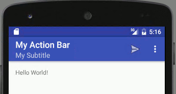
Similarly you can change the title and subtitle displayed in the action bar:
There are many other properties and methods that you can use to modify the way the action bar looks and behaves. Things that are worth looking up are:
Summary
|
'모바일개발(Mobile Dev) > 안드로이드개발(Android)' 카테고리의 다른 글
| android fingerprint making For Maps API (0) | 2016.06.12 |
|---|---|
| Android LayoutInflater Usage (0) | 2016.05.06 |
| android:style/Theme.Dialog java.lang.IllegalStateException: You need to use a Theme.AppCompat theme (or descendat) with this activity (0) | 2016.04.05 |
| Emulator cpu acceleration status : Hax kernel module is not installed (0) | 2016.03.16 |
| Android with USB Device 디버깅 사용하기 (0) | 2016.02.07 |